
Have you ever wondered what sets exceptional design apart from the mundane? The answer, my friends, lies in the artistry of typography. Why do certain websites captivate us while others leave us scrolling in boredom? typography wields enormous power because it is invisible in a world where visual information is at an all-time high. So, what makes typography supreme in the realm of design?
typography, in essence, is the art and science of arranging typefaces to convey a message. Your silent storyteller is all too familiar to those who see your logo, website, book, or poster. Typography changes the way we perceive and interact with the world around us, from selecting the right font to crafting content that is legible. In this article, we’ll go over the history, principles, and contemporary significance of typography, revealing its secrets.
Let’s get started on a typographic journey that will forever change the way you look at written text. Learn about the rich history of typography, the science behind its influence on everything from branding to web design, and why it matters so much. We’ll go over the world of letters and spaces, beginning with the importance of curves and serifs. Typography is one of the most captivating aspects of design.
History of Typography
The history of typography, an enchanting journey through the evolution of written communication, is a testament to the enduring power of human innovation. It is in this historical tapestry that we uncover the origins of typography, dating back to ancient civilizations where the seeds of written language were sown.
In the annals of history, one can trace the roots of typography to the cradle of civilization itself—the ancient Sumerians. Around 3500 BC, they employed cuneiform script, etching wedge-shaped marks into clay tablets, which served as one of the earliest forms of written communication. These meticulously crafted symbols not only conveyed ideas but also embodied the first inklings of typography, the art of arranging symbols to convey meaning.
Fast forward to the venerable Chinese civilization, and we encounter the groundbreaking invention of movable type during the Song Dynasty (960–1279 AD). Bi Sheng, a commoner with an uncommon genius, conceived the notion of individual characters carved onto clay and fired to create reusable type. This pivotal innovation paved the way for the dissemination of knowledge on an unprecedented scale.
However, it wasn’t until Johannes Gutenberg’s momentous invention in the mid-15th century that typography underwent a revolution that would alter the course of human history. Gutenberg’s printing press, with its moveable metal type, rendered manuscripts obsolete, democratizing access to information. His invention was akin to the internet of his time, enabling the rapid reproduction of books and documents. The Gutenberg Bible, printed around 1455, stands as a testament to his profound impact on typography and the spread of knowledge.
Typography’s influence on the dissemination of knowledge cannot be overstated. Before the advent of printing, the painstaking manual transcription of texts by scribes limited the availability of books and knowledge to a privileged few. Typography transformed this landscape, making literature and information accessible to a broader audience. The printed word became a catalyst for the Renaissance, the scientific revolution, and the enlightenment, propelling humanity into new realms of understanding.
In retrospect, typography has served as the bridge between oral traditions and written language, between the wisdom of the ancients and the enlightenment of the modern era. It has been an instrument of cultural preservation, fostering the exchange of ideas, and laying the foundation for the age of information we inhabit today.
As we navigate the digital age, where the keystrokes of a keyboard have supplanted the clank of movable type, it is imperative to acknowledge the historical significance of typography. It is the quintessential art that has endured the test of time, shaping the way we communicate, learn, and evolve as a society. Typography’s past is not merely a chronicle of ink and paper; it is a testament to the enduring human quest for knowledge, expression, and connection. In this ever-evolving landscape, let us not forget the profound impact of these artful arrangements of letters and symbols that continue to define our world.
The Art and Science of Typography

In the intricate world of design and communication, typography stands as both an art and a science, a delicate balance between aesthetics and functionality. At its core, typography embodies the fundamental principles of typefaces, fonts, and type families, shaping how we perceive and interact with written content.
The first pillar of typographic mastery lies in understanding typefaces. These are the broad categories that encompass fonts, each with its unique personality and design elements. Serif typefaces, characterized by the small lines or “serifs” at the ends of characters, exude a sense of tradition and formality. In contrast, sans-serif typefaces, sans those embellishments, exude modernity and simplicity. And then there are script typefaces, mimicking cursive handwriting, and display typefaces, reserved for headlines and logos, offering a flair of creativity. Selecting the right typeface is akin to choosing the right attire for an occasion; it sets the tone and conveys a message before a single word is read.
Font selection, the next layer of typographic mastery, delves deeper into the nuances of typefaces. It’s about choosing the right font size, weight, and style to ensure readability and aesthetics. Font size, measured in points, determines how legible your text is. It’s a balance between providing comfortable reading and optimizing space. Font weight, whether it’s light, regular, bold, or italic, can evoke a range of emotions and convey hierarchy within content. Font style, on the other hand, can add character; italics may imply emphasis, while underlining may suggest a hyperlink.
Yet, typography is not just about aesthetics; it’s also a science that delves into the psychology of design. It wields the power to shape perception and evoke emotions. Consider, for instance, the influence of color psychology in typography. The choice of colors in text can evoke feelings, such as trust (blue), excitement (red), or serenity (green). Beyond color, the arrangement of text, spacing between letters (kerning) and lines (leading), and even the choice of punctuation marks can impact how readers perceive and engage with content. A well-crafted typographic hierarchy can guide readers through the content, emphasizing key points and providing a seamless reading experience.
Typography also plays a crucial role in brand identity. Companies like Coca-Cola and Disney have iconic logos, instantly recognizable by their unique typography. The font used in a logo becomes synonymous with the brand itself, reinforcing recognition and trust. This is where the art of typography merges seamlessly with the science of branding.
Typography in Graphic Design
In the realm of graphic design, typography serves as the unsung hero, the silent conductor orchestrating visual symphonies that captivate, communicate, and leave an indelible mark on our psyche. It’s not merely a component but the very essence of graphic design, wielding profound influence in branding, marketing, and the creation of iconic visuals that resonate across time.
Typography’s role in graphic design is akin to the backbone of a well-structured narrative. It provides the framework upon which a brand’s identity and message are articulated. Think of it as the voice of a brand, communicating its personality, values, and promises to the audience. Effective branding hinges on the judicious selection of typefaces and fonts that encapsulate the essence of a brand. Whether it’s the bold, authoritative serif fonts of a financial institution or the playful, sans-serif fonts of a tech startup, typography sets the tone and fosters an immediate connection.
One need only glance at iconic logos like Coca-Cola’s flowing script or Nike’s bold, swooshing font to appreciate the transformative power of typography in branding. These logos are more than symbols; they are visual shorthand for brands that have become cultural touchstones. In the world of marketing, typography is the secret sauce that ensures that advertisements and promotional materials are not just seen but remembered. Catchy slogans, coupled with expertly chosen fonts, can make the difference between an advertisement that’s scrolled past and one that stops the scroll, inviting further exploration.
Typography also plays a pivotal role in poster design, a canvas where artistry and communication converge. From the striking typography of Saul Bass in movie posters to the psychedelic lettering of the 1960s counterculture movement, typography on posters isn’t merely text; it’s a visual experience. A well-designed poster leverages typography to draw the eye, convey a message, and leave a lasting impression. Each font, style, and layout choice is a brushstroke on the canvas of imagination.
Yet, typography’s true magic emerges when it synergizes with visual elements in design. In graphic design, it’s not about typography versus imagery; it’s about their harmonious interplay. The alignment of text with images, the choice of complementary colors, and the judicious use of white space all contribute to the overall impact of a design. Typography guides the viewer’s eye, directing attention to key messages and creating a rhythm that enhances comprehension and engagement.
Consider the packaging of your favorite products, where typography is not just functional but part of the product’s aesthetic appeal. It communicates vital information while elevating the brand’s identity, turning mundane items into coveted possessions. From the elegant labels on luxury wines to the bold, minimalist packaging of tech gadgets, typography transforms everyday encounters into memorable experiences.
In the digital age, where attention spans are fleeting and visual clutter abounds, the artful use of typography is more critical than ever. In a single glance, typography can communicate trustworthiness, innovation, excitement, or serenity. It can invite you to explore, click, and discover. It’s the difference between a website that feels like home and one that feels like a maze.
Typography in Web Design
Typography in web design is a dynamic fusion of art and functionality, where the nuances of typeface, readability, and user experience converge to shape a digital landscape that is both aesthetically pleasing and highly functional. When it comes to web design, typography isn’t just about selecting beautiful fonts; it’s about understanding the unique considerations of the digital realm and how typography influences user interactions.
One of the distinctive considerations in web design typography is readability across various devices and screen sizes. With the proliferation of smartphones, tablets, laptops, and desktops, designers must ensure that text remains legible and visually appealing regardless of the device being used. This necessitates the use of responsive typography, a technique that adjusts font sizes, line spacing, and layouts dynamically to adapt to different screen sizes. The days of fixed font sizes are long gone; today’s web typography is fluid, ensuring that users can comfortably read content on a smartphone while enjoying a seamless experience on a large desktop monitor.
Responsive typography also addresses the importance of hierarchy in web design. Headlines, subheadings, and body text must be distinct yet harmonious, guiding users through the content hierarchy effortlessly. It’s about making sure that users immediately recognize the most important information while maintaining a pleasant reading flow. This involves not only adjusting font sizes but also carefully selecting typefaces and font weights that enhance readability and engagement.
The use of web fonts has emerged as a game-changer in web design. Unlike traditional system fonts, web fonts are specifically designed for online use and are hosted on remote servers, ensuring consistent rendering across devices and browsers. This allows designers to unleash their creative potential by choosing from an extensive library of fonts that were previously unavailable for web use. However, with great font diversity comes the responsibility of optimization. Web font file sizes can affect page load times, impacting user experience and SEO. Thus, designers must strike a balance between aesthetic appeal and performance, choosing web fonts wisely and optimizing their implementation.
The impact of web fonts on user experience cannot be overstated. Typography influences how users perceive a website’s credibility, professionalism, and brand identity. A well-chosen font can evoke emotions, set the tone, and reinforce a brand’s personality. Conversely, poor typography choices can lead to frustration and a high bounce rate as users struggle to engage with the content. It’s not just about choosing fonts that look good; it’s about selecting fonts that align with the website’s purpose and audience.
In the digital era, where attention spans are shorter than ever, typography plays a pivotal role in user engagement. The strategic use of headlines, subheadings, and call-to-action buttons can guide users through the content, keeping them engaged and encouraging them to explore further. Typography isn’t just about aesthetics; it’s a powerful tool for communication and user interaction.
In conclusion, typography in web design is a multifaceted discipline that blends aesthetics, responsiveness, and user experience. It’s about making text not only beautiful but also functional, ensuring that users can read and engage with content seamlessly across devices. Web fonts have expanded the designer’s toolbox, but with great choice comes the responsibility of optimization. In the digital landscape, where first impressions matter, typography is the silent ambassador that communicates a website’s essence and influences user behavior. As web design continues to evolve, typography remains a cornerstone, shaping the digital experiences we encounter every day.
Typography in Print vs. Digital Media
Typography, the art and science of arranging typefaces to convey a message, is a realm where tradition and innovation converge, with each medium – print and digital – offering its unique canvas for expression.
In the realm of traditional print media, typography takes center stage as the cornerstone of visual storytelling. The ink-on-paper experience provides a tactile and immersive encounter with text, inviting readers to engage with content in a deliberate and contemplative manner. Typography in print embodies enduring principles, where typefaces, fonts, and layout design play pivotal roles. Serif typefaces like Times New Roman and Garamond evoke a sense of elegance and tradition, while sans-serif fonts like Arial and Helvetica convey modernity and clarity. Print designers can meticulously craft every detail, choosing the perfect paper, ink, and typeface to create a sensory experience that lingers in the memory.
However, the world of print is bounded by physical constraints. Once a publication goes to press, making changes becomes arduous and costly. This limitation stands in stark contrast to the dynamic and fluid nature of the digital landscape. Digital media has revolutionized typography by granting designers unparalleled flexibility. In the realm of digital platforms, typography becomes adaptable, responsive, and interactive. Web designers harness the power of responsive typography, adjusting font sizes and styles to ensure optimal legibility across a myriad of devices, from smartphones to desktops.
Digital typography also brings forth the era of web fonts, opening a vast library of typefaces tailored for online use. Typography in digital media presents distinct advantages. Web designers can incorporate animations, transitions, and hover effects, enhancing the user experience and engagement. Moreover, hyperlinking and interactivity provide a seamless navigation experience, turning typography into a pathway for exploration. Websites like Google Fonts and Adobe Typekit offer an expansive repertoire of web fonts, transforming the digital sphere into a typographic playground.
Yet, with this newfound freedom, digital typography faces its own set of challenges. The online landscape is cluttered with distractions, necessitating a balance between captivating design and user-focused functionality. Typography must guide the reader’s eye through the content hierarchy while maintaining optimal readability. The paradox of choice can also lead to the overuse of fonts or flashy styles, sacrificing clarity for aesthetics.
In the ever-evolving realm of digital typography, trends continue to shape the visual landscape. Minimalism, with its focus on clean lines and simplicity, has gained prominence, prioritizing legibility and user experience. Variable fonts, a recent innovation, allow designers to create fluid typographic experiences, adjusting weight, width, and other parameters seamlessly.
Accessibility and Inclusivity in Typography
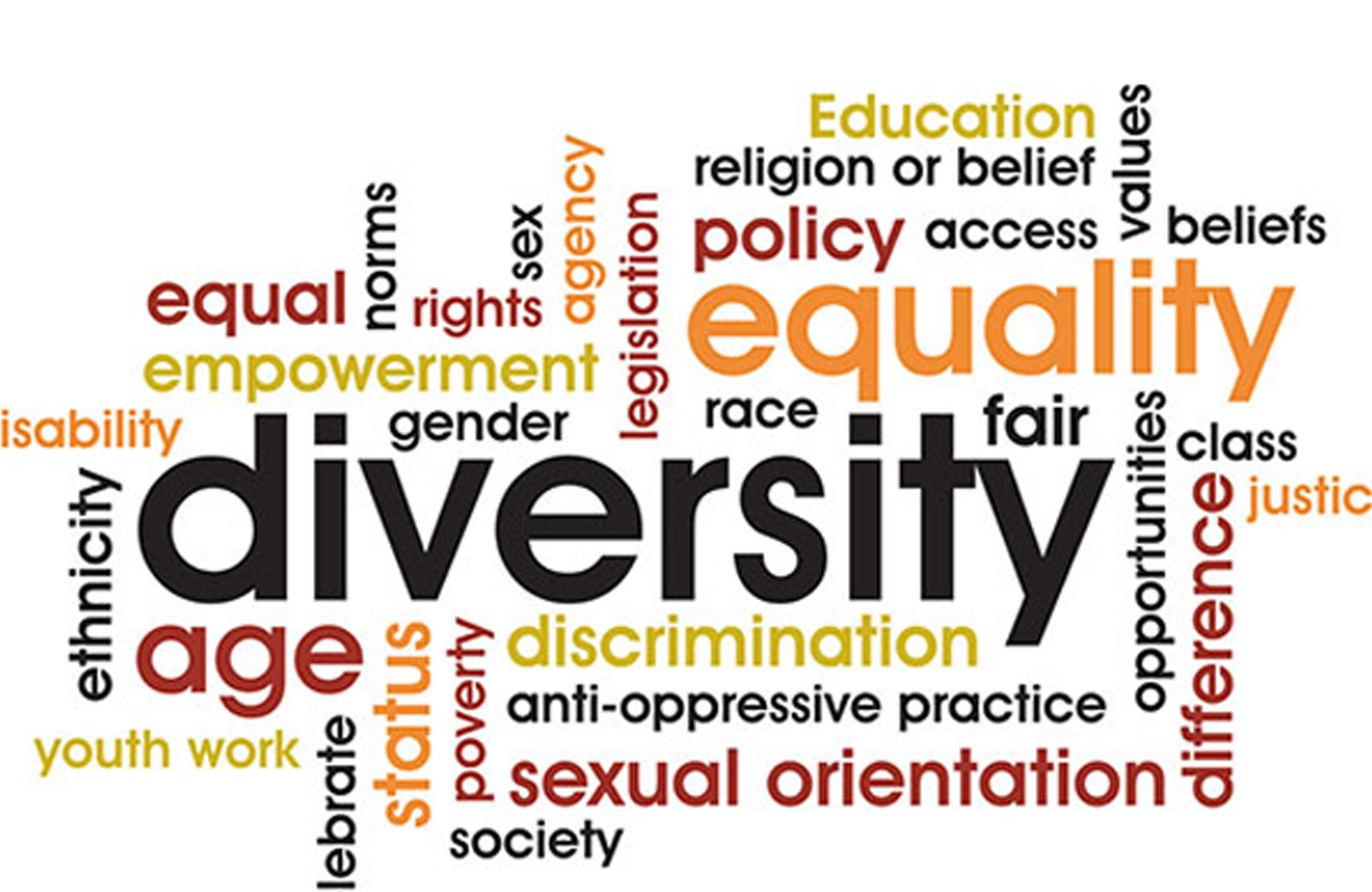
Accessibility and inclusivity in typography represent the embodiment of a digital world that strives to leave no one behind. In an era where information and communication are increasingly digital, the importance of making typography accessible to individuals with disabilities cannot be overstated.
For those with visual impairments or other disabilities, accessible typography is a lifeline to the digital realm. It ensures that content is perceivable, operable, and understandable for all users, regardless of their abilities. The first step in achieving this is to prioritize legibility. Typeface selection is pivotal; sans-serif fonts are often more legible than their serif counterparts, and ample font size and line spacing are crucial for readability. Additionally, providing alternative text for images and videos allows screen readers to convey visual content to users who are blind or have low vision.
One of the cornerstones of accessible typography is proper semantic markup. This involves using HTML tags correctly, such as headings (h1, h2, h3, etc.), lists, and paragraphs. Screen readers rely on these tags to interpret and convey the hierarchical structure of content. Using headings appropriately not only aids navigation but also conveys the organization of information. Additionally, providing clear and concise content that avoids jargon and complex language benefits all users but is particularly critical for those with cognitive disabilities.
Another crucial aspect of inclusive typography is contrast. Ensuring sufficient contrast between text and background colors enhances readability, particularly for individuals with low vision or color blindness. Designers must adhere to the Web Content Accessibility Guidelines (WCAG) to determine the appropriate level of contrast. Furthermore, resizable fonts and responsive design accommodate users who may require larger text or have different screen sizes.
Inclusive typography also extends to considerations for those with motor impairments. Keyboard navigation is a fundamental aspect of accessibility, allowing users to navigate a website without a mouse. Ensuring that interactive elements, such as buttons and links, are navigable via keyboard is essential. Additionally, providing adequate spacing between clickable elements prevents accidental clicks and enhances the overall user experience.
As technology evolves, so do the tools and techniques for creating accessible typography. Scalable vector graphics (SVG) and variable fonts, for example, offer greater flexibility in creating accessible typography while maintaining design aesthetics. Variable fonts, in particular, allow for variations in weight, width, and other typographic attributes, accommodating diverse user preferences and needs.
To exemplify best practices for inclusive typography, many organizations and designers have embraced the concept of “universal design.” This approach seeks to create digital content and interfaces that are accessible to the widest possible audience from the outset, eliminating the need for retrofitting or specialized versions of websites. It promotes a shift in mindset where accessibility is integrated into the design process rather than treated as an afterthought.
Typography in the Age of Branding
In the age of branding, typography has ascended to a position of paramount significance, serving as the linchpin that cements a brand’s identity and fosters immediate recognition. It’s not merely a component of brand aesthetics but a powerful tool that encapsulates a brand’s essence and communicates its values to the world.
Typography is the unspoken language of a brand, a visual signature that carries the weight of the brand’s personality and story. It shapes the first impression and sets the tone for every subsequent interaction. A carefully selected typeface can evoke emotions, elicit trust, and define a brand’s character. Serif fonts convey tradition and reliability, while sans-serif fonts exude modernity and simplicity. For instance, the iconic Coca-Cola logo, with its distinctive script font, conjures feelings of nostalgia and timelessness, while the sleek, sans-serif font of Apple exudes innovation and elegance.
Successful brands understand that typography is not a one-size-fits-all endeavor but a bespoke journey. The process of creating a unique typographic identity begins with a deep dive into the brand’s essence, values, and target audience. This exploration informs the selection of typefaces, font weights, and even custom typography that align with the brand’s narrative. A brand’s typographic identity should be consistent across all touchpoints, from websites and packaging to advertisements and social media profiles. This consistency fosters recognition and trust, reinforcing the brand’s presence in the minds of consumers.
A compelling case study in brand typography can be found in the evolution of Airbnb’s branding. The company’s original logo, often referred to as the “Bélo,” featured a custom typeface designed to resemble a heart and the letter “A.” While the concept was novel, the font faced criticism for its ambiguity and lack of clarity. Airbnb recognized the need for a more refined and universally recognizable typographic identity. In 2014, the company introduced a custom typeface known as “Cereal” to replace the Bélo. Cereal was designed to be distinctive, legible, and versatile, aligning with Airbnb’s brand values of inclusivity and global community. This typographic shift exemplified the importance of clear and consistent typography in brand communication.
In the digital landscape, where brands have mere milliseconds to capture a user’s attention, typography becomes a critical tool for engagement. The strategic use of fonts, font sizes, and typographic hierarchy guides users through web content, ensuring they absorb key messages and calls to action. A well-considered typographic system enhances user experience, making navigation intuitive and content digestible. Brands like Nike, with their bold and impactful use of typography, effectively convey their messages and inspire action.
In the age of branding, typography is no longer just an aesthetic choice; it’s a strategic decision that can make or break a brand’s success. It’s the silent ambassador that tells a brand’s story, communicates its values, and fosters an emotional connection with the audience. Typography is not just about letters and words; it’s about creating a visual language that resonates with consumers and leaves an indelible mark on the brand landscape. As we continue to navigate a world saturated with brands vying for attention, the power of typography remains unrivaled, ensuring that brands not only speak but are heard and remembered.
Typography Tools and Software
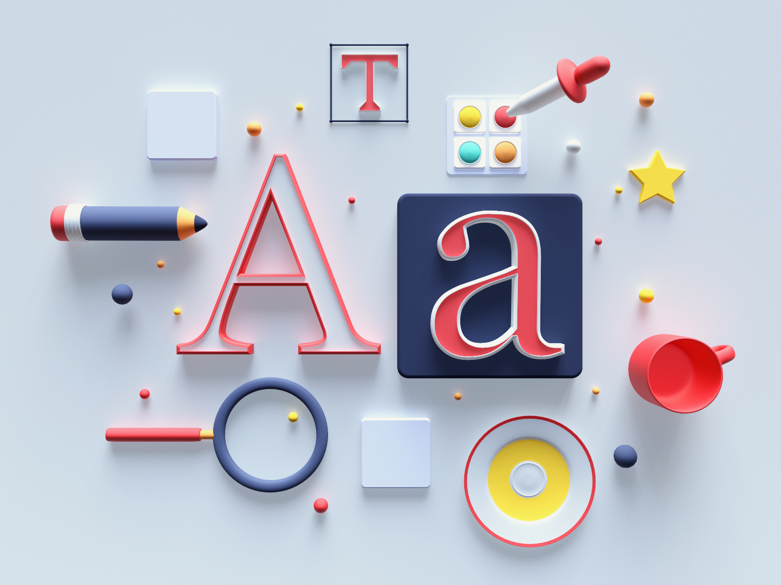
In the ever-evolving world of design, typography tools and software play a pivotal role in shaping the way we create and manipulate text. These digital companions empower designers to bring their typographic visions to life, whether they’re crafting a striking poster, designing a user-friendly website, or creating an elegant logo. Let’s delve into some of the popular typography tools and software, explore their features and benefits, and offer recommendations for both beginners and seasoned professionals.
Adobe Creative Cloud Suite
- Overview: Adobe Creative Cloud is a comprehensive suite of design software that includes Adobe Photoshop, Illustrator, InDesign, and more. These tools offer a wide range of typographic capabilities, from customizing fonts to creating intricate text effects.
- Features and Benefits: Adobe’s software provides an extensive library of fonts, powerful text manipulation tools, and the ability to work seamlessly with vector graphics. It also supports OpenType fonts, allowing for advanced typography control.
- Recommendation: Adobe Creative Cloud is an industry standard for design professionals. It’s suitable for both beginners and experts, offering a diverse set of tools for typography and beyond.
Google Fonts
- Overview: Google Fonts is a free, web-based service that provides access to a vast collection of open-source fonts. Designers can easily integrate these fonts into web projects.
- Features and Benefits: Google Fonts offers a user-friendly interface for browsing and selecting fonts. It provides web-friendly versions of fonts, optimized for online use. The service is entirely free and includes a variety of font styles.
- Recommendation: Google Fonts is an excellent choice for web designers, especially those looking for a cost-effective solution. It’s beginner-friendly and offers a wide range of font options.
FontLab
- Overview: FontLab is a professional font design software that allows designers to create, edit, and manipulate typefaces.
- Features and Benefits: FontLab offers powerful typography tools, such as glyph creation and kerning adjustments. It supports various font formats, making it suitable for font designers. It provides detailed control over every aspect of a font.
- Recommendation: FontLab is primarily for font designers and experienced typographers. It’s an advanced tool with a steeper learning curve but offers unparalleled control.
Canva
- Overview: Canva is a user-friendly, web-based design platform that provides templates and tools for creating various design projects, including typography-heavy ones.
- Features and Benefits: Canva offers a library of templates, fonts, and design elements. It’s accessible for beginners and streamlines the design process with drag-and-drop functionality.
- Recommendation: Canva is an ideal choice for beginners and non-designers who need to create visually appealing documents, social media graphics, or marketing materials with typography.
FontExplorer X
- Overview: FontExplorer X is a font management software that helps designers organize and manage their font libraries.
- Features and Benefits: FontExplorer X allows designers to preview fonts, activate them as needed, and organize fonts into sets or categories. It helps maintain a clean and efficient font workflow.
- Recommendation: FontExplorer X is a valuable tool for designers who work with extensive font libraries, ensuring fonts are organized and readily available.
The Future of Typography
The future of typography holds a tantalizing blend of innovation, evolution, and limitless possibilities. As we venture into this uncharted territory, it becomes evident that typography, the art and science of arranging type, is poised for a fascinating transformation. Let’s embark on a journey through the looking glass of the future of typography, where trends, technology, and the human touch converge to redefine how we communicate visually.
1. Dynamic Typography for the Digital Age
- Trends: In the digital realm, static typography is giving way to dynamic and responsive typography. Websites and apps are adopting variable fonts that adapt seamlessly to different screen sizes and resolutions. This dynamic approach enhances user experience and readability.
- Impact: Dynamic typography aligns with the demands of responsive web design and mobile optimization. It ensures that text remains legible and visually pleasing across various devices, from smartphones to large desktop monitors.
2. AI-Powered Typography Design
- Trends: Artificial intelligence (AI) is making its mark on typography. AI algorithms can analyze vast font databases and generate fonts based on specific criteria. This automation expedites font creation, opening doors for designers to experiment and innovate.
- Impact: AI-driven typography can democratize font design, making it more accessible to a broader audience. Designers can harness AI to assist in font selection, pairing, and even generating custom fonts, streamlining the design process.
3. Embracing Variable Fonts
- Trends: Variable fonts, which allow for the adjustment of font characteristics like weight, width, and slant, are gaining traction. They offer flexibility and reduce the need for multiple font files, optimizing web performance.
- Impact: Variable fonts empower designers to create unique typographic experiences tailored to specific content and contexts. They contribute to faster loading times and improved accessibility.
4. Haptic and Multisensory Typography
- Trends: Typography is extending beyond the visual realm, embracing haptic and multisensory experiences. Designers are experimenting with tactile typography, exploring how fonts can be experienced through touch and even sound.
- Impact: Multisensory typography has the potential to enhance accessibility for individuals with visual impairments. It also enriches branding and marketing efforts by creating memorable sensory experiences.
5. Sustainability in Typography
- Trends: Sustainability is no longer limited to product design; it’s seeping into typography. Designers are exploring eco-friendly fonts and practices that reduce carbon footprints, such as using less ink or opting for eco-friendly paper.
- Impact: Sustainable typography aligns with the broader sustainability movement, emphasizing responsible design choices. It resonates with environmentally conscious consumers and can become a branding element.
6. Collaboration and Global Typography
- Trends: The global nature of design and communication requires typography to transcend borders. Collaboration among designers from different linguistic and cultural backgrounds is fostering the creation of diverse and inclusive typographic styles.
- Impact: Global typography celebrates diversity, promotes inclusivity, and acknowledges the richness of languages and cultures. It enables brands to connect with audiences on a global scale.
7. Typography as a Storytelling Medium
- Trends: Typography is becoming a storytelling medium in its own right. Designers are integrating animated and interactive typography into narratives, creating immersive digital experiences.
- Impact: Typography-driven storytelling engages audiences in new ways, merging the visual and narrative elements. It has applications in digital marketing, interactive web design, and digital art.
More questions
- What role does typography play in design and communication?
Typography is a linchpin of design and communication. It wields the power to convey messages, evoke emotions, and establish brand identities. The choice of typefaces, fonts, and layout profoundly influences readability, aesthetics, and user experience. In design, typography serves as a visual language, guiding the viewer through content hierarchy and aiding comprehension. It can communicate formality or informality, elegance or playfulness, aligning with the intended tone.
Moreover, in branding, typography becomes a brand’s distinctive voice, instantly recognizable and memorable. It embodies a brand’s personality and values, reinforcing its visual identity. Effective typography enhances user engagement, accessibility, and overall communication effectiveness. In essence, typography is the unsung hero that bridges the gap between words and visual impact, making it an indispensable element in design and communication strategies.
- What are the essential principles of typography?
The essential principles of typography form the backbone of effective visual communication. These principles include:
Legibility and Readability: Type should be easy to read, with clear distinctions between characters. Proper spacing, font size, and contrast contribute to legibility.
Hierarchy: Establish a clear hierarchy to guide the reader’s eye. Use varying font weights, sizes, and styles to emphasize important information.
Alignment: Maintain consistent alignment for a polished look. Choose between left, right, center, or justified alignment based on the design’s purpose.
Contrast: Contrast in type size, color, and style helps create visual interest and separates content into meaningful sections.
Consistency: Maintain uniformity in fonts, spacing, and formatting throughout a document or design to ensure coherence.
White Space: Adequate white space around text enhances readability and overall aesthetics. Avoid overcrowding.
Typeface Selection: Choose typefaces that align with the message and audience. Serif fonts for traditional, sans-serif for modern, and decorative for artistic purposes.
Kerning and Tracking: Adjust letter spacing (kerning) and word spacing (tracking) for optimal legibility and visual appeal.
Line Length: Control the number of characters per line to prevent text from becoming too long or short, which can strain the reader’s eyes.
Grids and Layout: Utilize grids to create structured layouts, ensuring content placement is organized and visually pleasing.
These principles serve as a foundation for effective typography, enabling designers and communicators to convey messages with clarity, impact, and style.
- How can typography enhance brand recognition?
Typography is a potent tool for bolstering brand recognition. When used strategically, it creates a unique and memorable brand identity. Consistent typefaces and fonts in marketing materials, logos, and other brand elements foster familiarity. This consistency helps consumers instantly recognize and associate the typography with a particular brand.
Typography also conveys brand personality and values. Whether it’s a bold, modern sans-serif font signaling innovation or a classic serif font evoking tradition, the choice of typeface communicates essential aspects of the brand’s character.
Moreover, custom fonts or distinctive typography treatments set a brand apart from competitors, making it stand out in the crowded marketplace. Think of Coca-Cola’s script font or Disney’s whimsical lettering – they’re instantly identifiable.
In summary, typography plays a crucial role in brand recognition by creating a visual language that consumers come to associate with a brand, fostering trust and loyalty over time.
- What are the emerging trends in typography for the future?
Emerging trends in typography point to an exciting future. Variable fonts, which allow for dynamic adjustments in weight, width, and style within a single font file, are gaining ground. These fonts enhance responsive design and creativity.
Non-traditional typefaces, such as those inspired by hand-drawn lettering or graffiti, are becoming popular for conveying authenticity and individuality.
Accessibility-driven typography focuses on creating inclusive designs with improved legibility and readability, catering to diverse audiences, including those with visual impairments.
Motion typography, seen in kinetic logos and dynamic website headers, engages users with visually appealing animations.
Minimalist and oversized typography is favored for its clean, impactful aesthetic in branding and design.
Artificial intelligence and machine learning are also influencing typography, with algorithms generating custom fonts based on design parameters.
In summary, typography’s future is dynamic, inclusive, and tech-driven, offering exciting possibilities for designers and enhancing user experiences across various media.
- How can designers create inclusive typography?
Designers can foster inclusive typography by following key principles:
Font Selection: Choose readable typefaces with distinct characters. Sans-serif fonts often work well. Consider typefaces designed with accessibility in mind.
Font Size and Spacing: Ensure text is of sufficient size, with appropriate line spacing and letter spacing (kerning) to enhance legibility.
Color Contrast: Use high-contrast color combinations between text and background to aid those with visual impairments. Aim for a minimum contrast ratio.
Alternative Text: Include descriptive alt text for images, icons, and decorative elements to make content accessible to screen readers.
Semantic HTML: Use semantic HTML tags to structure content logically. Headings, lists, and links should be clearly labeled.
Responsive Design: Ensure typography adjusts gracefully across various devices and screen sizes.
Language and Readability: Use plain language and avoid jargon. Maintain a simple, straightforward writing style.
Testing and Feedback: Conduct usability testing with diverse user groups, including individuals with disabilities, and incorporate their feedback into design improvements.
By adhering to these principles, designers can create typography that is accessible and inclusive, ensuring that content is available and comprehensible to a broad range of users, regardless of their abilities.
- What is the psychology behind font selection in design?
Font selection in design is rooted in psychology, as it profoundly influences how people perceive and engage with content. Different fonts evoke specific emotions and associations. For instance, serif fonts like Times New Roman convey tradition, trustworthiness, and formality, making them suitable for scholarly publications.
Conversely, sans-serif fonts like Helvetica appear modern, clean, and approachable, ideal for branding and digital interfaces. Script fonts evoke elegance and creativity, often used in luxury branding.
Size and spacing impact readability and comprehension. Larger fonts convey importance, while tight kerning can create a sense of urgency.
Typography’s psychology also plays a role in user experience. A well-chosen font can enhance engagement, trust, and brand identity. In contrast, poor font choices can deter users and diminish the impact of content.
In summary, font selection in design is a powerful tool for influencing user perception and behavior, making it a crucial consideration for effective communication and branding.
- Why is accessible typography crucial in the digital age?
Accessible typography is paramount in the digital age for several reasons. First, it ensures inclusivity by making digital content accessible to individuals with disabilities, such as visual impairments. Properly designed typography, with legible fonts, appropriate spacing, and high contrast, enables screen readers to interpret and convey content accurately.
Second, it enhances user experience. Clear typography improves readability, reducing user fatigue and frustration. It ensures that a wider audience can engage with online content effectively, promoting longer visits and better comprehension.
Third, accessible typography has legal implications. Many countries have regulations mandating web accessibility, and non-compliance can lead to legal issues and reputational damage.
Lastly, search engines prioritize accessibility, considering it a ranking factor. Websites with accessible typography tend to rank higher, improving visibility and reach.
In essence, accessible typography aligns with ethical, user-centric, and SEO-driven practices, making it a critical component of digital content creation in the modern era.
